Truist
The future of finance

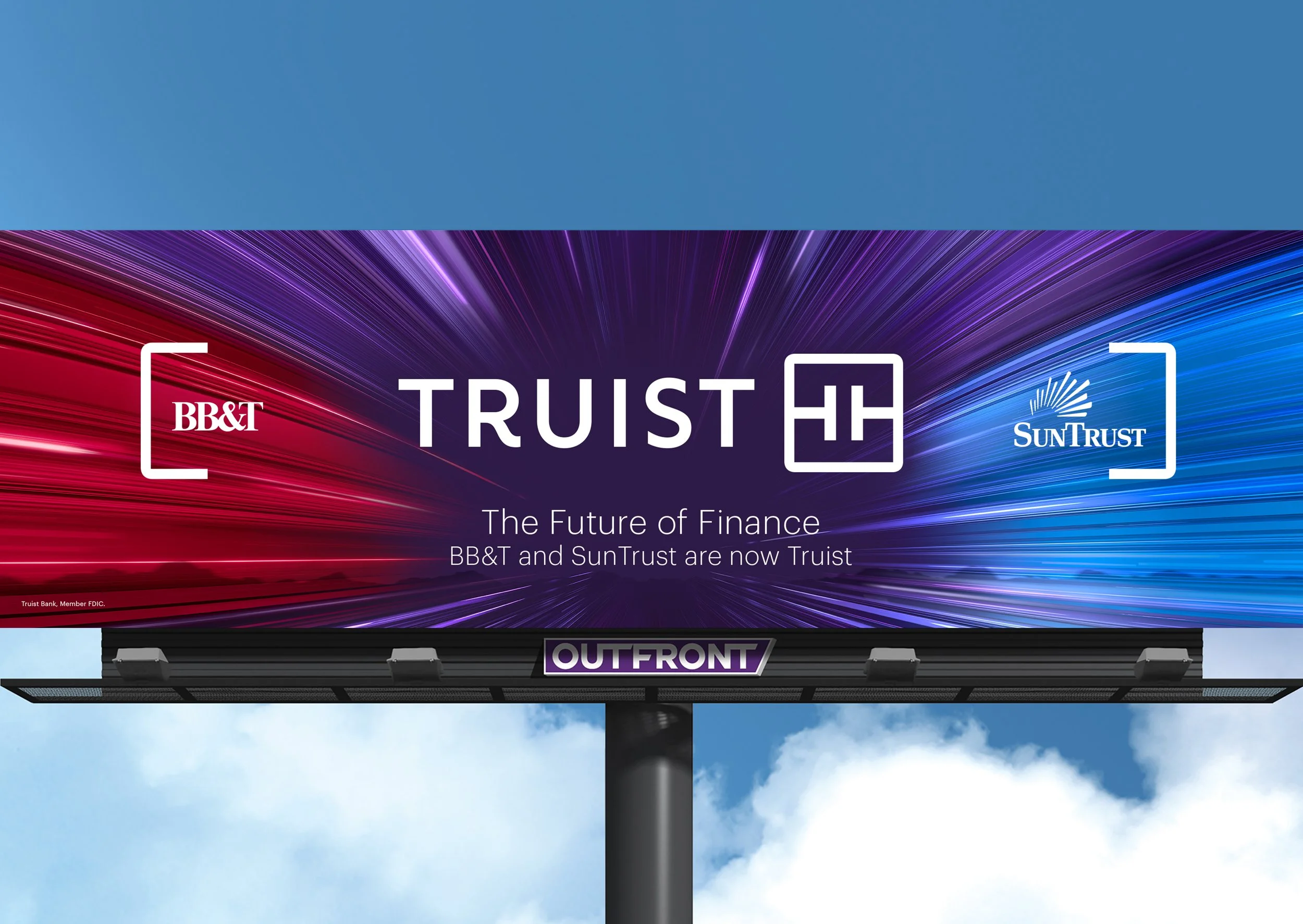
The Future of Finance Campaign
Truist’s only goal was to gain name recognition. It was a brand new bank after all. With hundreds of print, digital, and outdoor placements across the United States in airports, malls, and homes, we launched them into the stratosphere with our merger campaign. Once they established themselves as the sixth largest financial institution, they needed meaning. Care became their overarching message and from there on out, every piece of creative put out revolved around Truist being a bank that cares for its customers. Because the branding was designed by a specialized company, we were limited in our ability to branch out, which worked well for us. We were able to focus on making meaning of the convoluted nature of banking.


The Work
Gone were the red and blue of their former selves. Truist’s color palette consisted of three purples and a teal, with which we created a rainbow of creative. Doing at least two campaigns per year under the Care umbrella, we solidified their approach to marketing and fine tuned their visual style. Even with an extensive style guide to adhere to, we needed to further flesh it out in practical terms. As you can see, we played around a little to varying degrees of success and set Truist on their path to greater success.
Deliverables worked on: art direction, design, production (print, out-of-home, digital, social, video, image search, retouching, & copywriting)
“Come Together” Merger Commercial
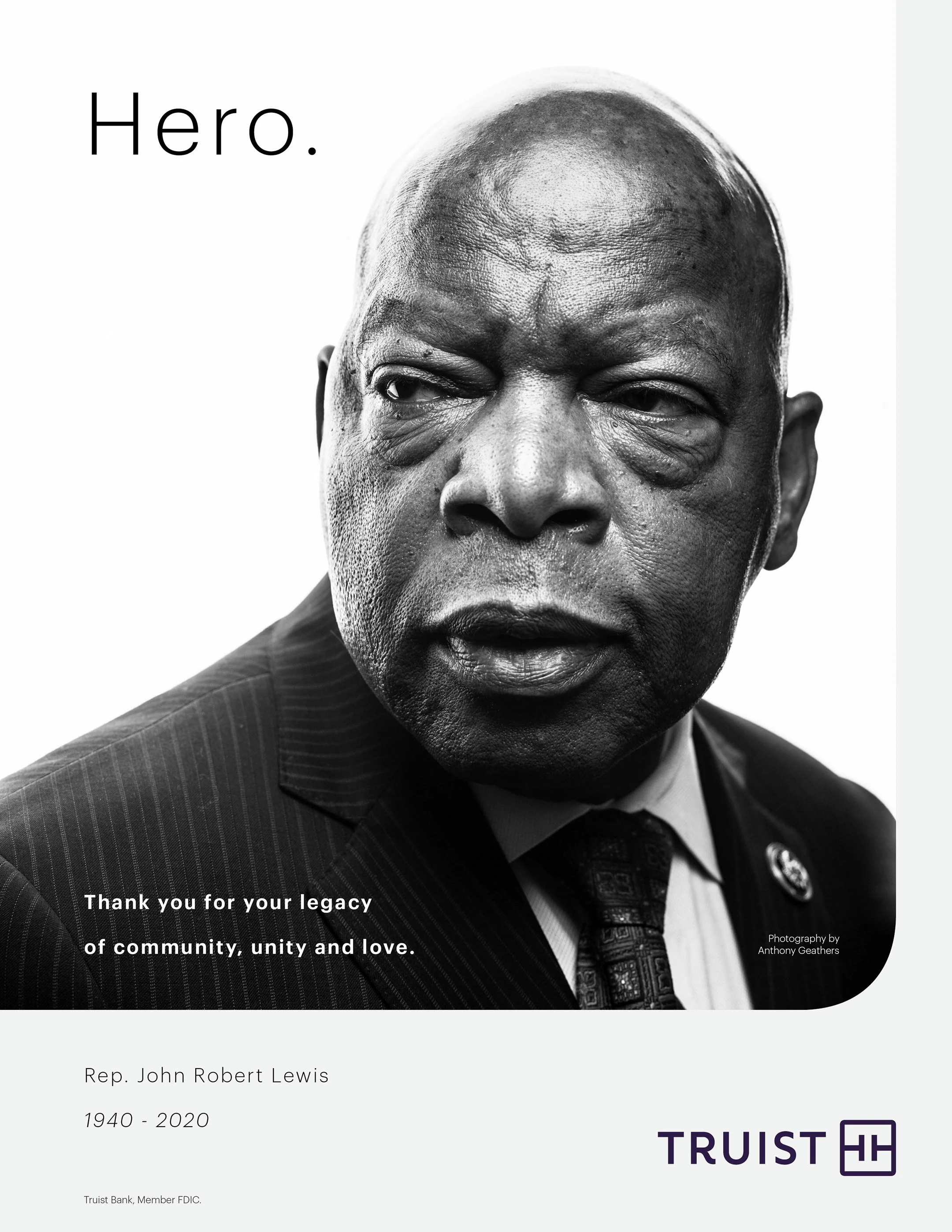
Print Ads


Results
Art Direction Concepts


TV Spots and Case Study Video
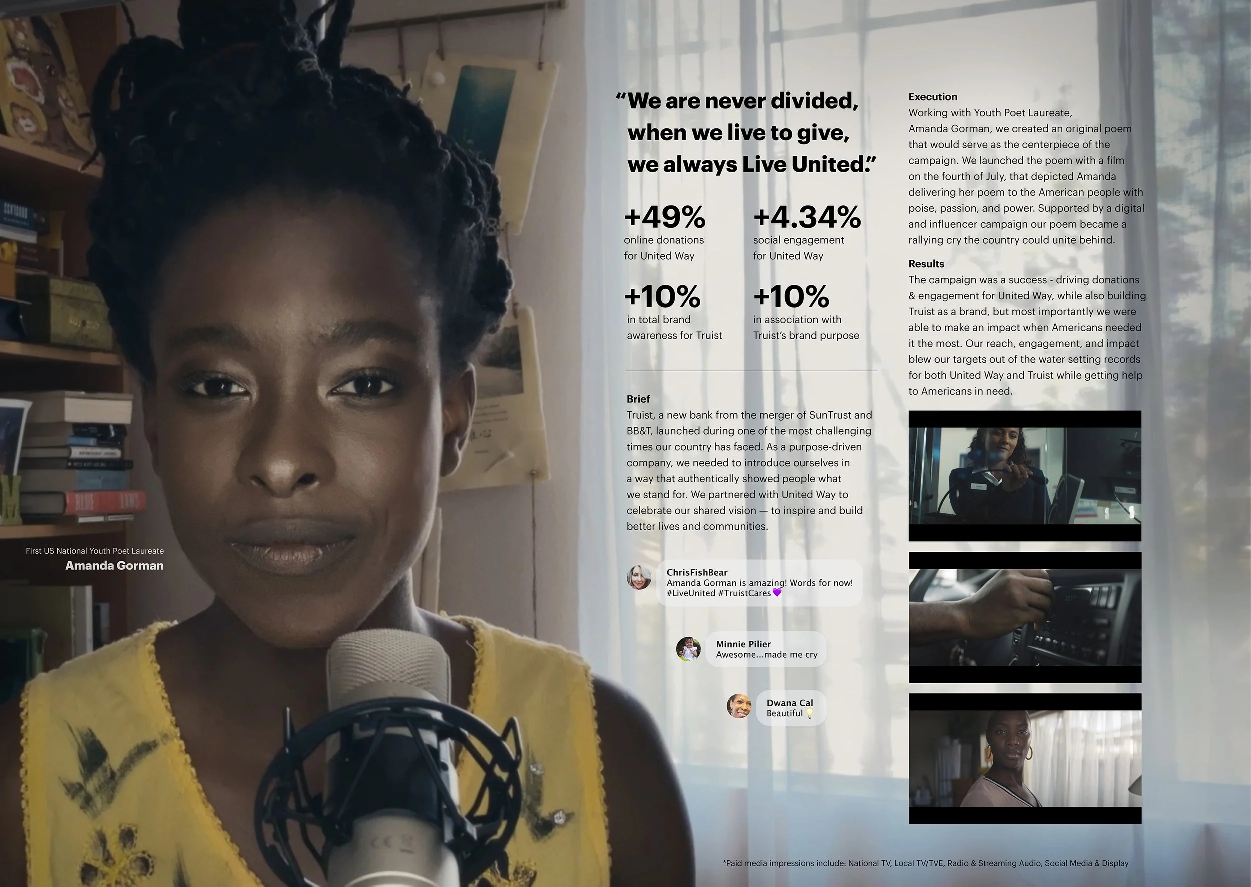
“Live United” Amanda Gorman Commercial in Partnership with United Way
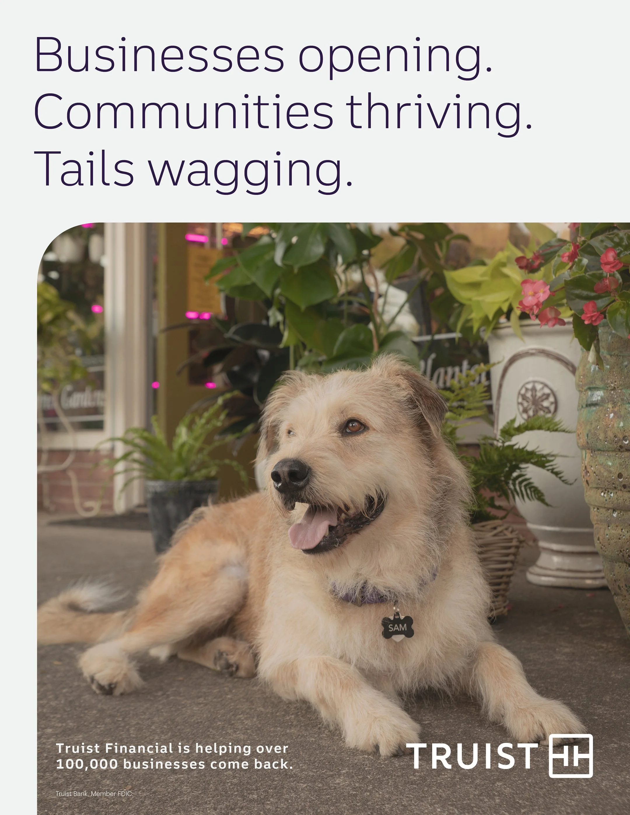
“Main Street Sam” Post-Pandemic Small Business Commercial
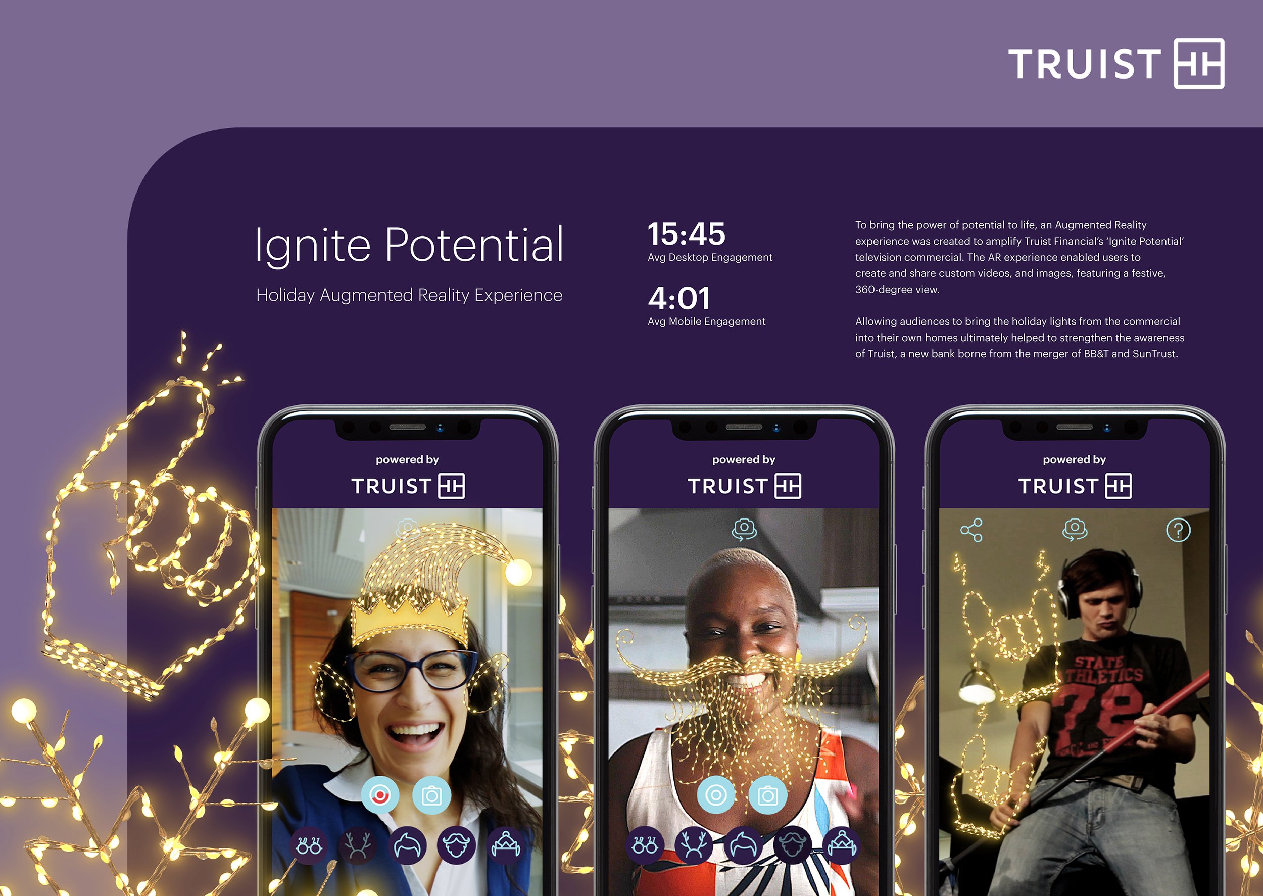
“Ignite Potential” Holiday Commercial
“Believe In Possible” Super Bowl Sponsorship Commercial
One of a Set of Four “Care” Initiative Commercials
“The Caremaker” Commercial
Campaign Case Study Video
Merger Animation for Social & Digital